Creative Strategy
Creative strategy or creative tragedy.
So all your hard work has been done, and now you've come to the creative department with reams of paper and heart in hand. Advertising plan, marketing strategy, brand guidelines, visual ID, mood boards and maybe a little something to placate the creative angst - room to play. When developing a creative strategy it's important not to forget to be creative. It's easy to fall into ruts rather than ask some of the tough questions and allow the process to flow freely up and down stream. Here's some examples of things coming together nicely:
Family Pizza: Decisions

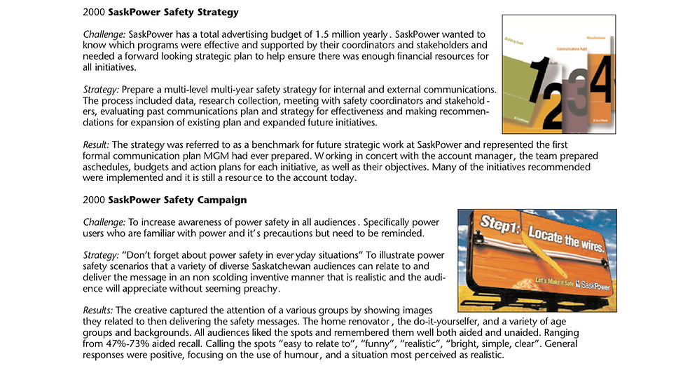
BRIEF OF EFFECTIVENESS
Family Pizza Campaign 2018-2023 – Creative Strategy
Brand Name: Family Pizza
Product Type or Description: Pizza Restaurant
Campaign Titles: Decisions, We Deliver, Great Slice.
Client: Family Pizza
Marketing Challenge
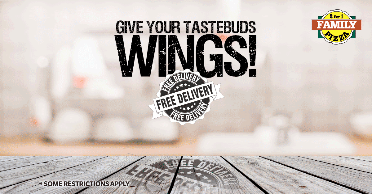
Background: Family Pizza began in Humboldt, Saskatchewan where the first store and the menu of recipes was initially developed. From it’s “Humboldt Beginnings", the new franchise opened several stores in Saskatchewan. They had 8 stores when Hunter Creative began work with them in two provinces that traditionally focused their brand messaging on price. The 2 for 1 value proposition anchored in their logo made this their clear unique selling point. Most of their advertising (inset above) including the use of bright yellow and no product to help emphasize a price point. Their desire to move into a more lucrative market niche was hampered by the value message overshadowing quality.
Challenge: The pizza market is jammed full of competition. Especially at the bottom where local stores compete on price and convenience. We needed to move the brand into a more profitable and less congested premium niche. Several of the stores were anchored in strip mall settings and were profit focused. They were primarily take out relying on daily specials and pizza-by-the-slice product to succeed in this very competitive market. In order to realize a greater "slice of the pie", we would need to move up into a premium market occupied by heavy hitters such as Pizza Hut, Dominoes, Pizza 73, Panago, Papa John’s, and Little Caesars. With only 8 stores our ability to compete with their messaging and advertising budgets would be difficult.
Message
“Family Pizza creates a premium quality diverse menu for the whole family, at a fair price in convenient locations.”
Addressing the audience: The creative speaks to diverse families while communicating in a fun, friendly tone and manner. There is something for everyone at our restaurant and it’s affordable.
Campaign Objectives
Rebrand FP and move them into a new market niche. Focusing on a premium product at a fair price message. Increase market share and awareness of the diverse menu with our dedication to quality and at a reasonable price.
Target Audience
Primary: All Saskatchewan residents that live within a Family Pizza franchise.
Secondary: Potential Franchise owners
Key Characteristics: Much of the audience is aware of price conscious Family Pizza but not of the new quality commitment and larger menu.
Creative Strategy and Implementation
“Great Slice, Great Price.”
Using a simple phrase that is easy to read and remember, we re-introduce a product focused message with newly enhanced photography and more polished look that still reinforces the price value message.
“Decisions, Decisions.”
Using a familiar simple phrase that is easy to read and remember, we introduce ads featuring a variety of pizzas. It plays upon the 2 for 1 existing brand while a newly focused message with enhanced photography and more polished look says we have more to offer than you thought. As we added to the menu this messaging took on broader menu scope.
“We Deliver.”
Originally a “Free” Delivery offering that was discontinued, our rebrand focuses on the corporate commitment to quality product and experience.
We improved the web experience making the ordering process much easier and redesigning pages to add more enhanced images and promotional offerings. We created over 1000 social media posts that infused personality into the brand. Rebranding the content to focus on our product as hero with every posting incorporating beautiful mouth watering images accompanied by a witty headline. Always making sure every message has our logo and the consistent look of our new brand to help curb our competition "borrowing" ads. The stores also under went extensive upgrades that included new corporate colours, boxes, wall and window decals and digital menu boards.
Media Strategy
Limited budget meant utilizing flyers, webpage, billboard and portable outdoor, bus boards, store fronts and window decals, print and social media.
• Social Media – With creative daily postings on Instagram and Facebook to compliment offers.
• Point of Purchase – Boxes, portable signs, window decals, digital menu and sandwich boards.
• Out-of-Home – Flyer menu mailer.
• Public Relations, sponsorships
• Promotional web page with menu
• Outdoor (Various)
Total Media Expenditure
• 10k Month
Evidence of Results
Family Pizza has enjoyed record profits in the years following the rebrand. They have opened over 20 new stores and expanded into four Canadian provinces in the 5 years we have been working together.Total sales volumes have increased 20-40% and profits have increased exponentially even through the pandemic that saw many of the competition struggle to maintain market share. Major competitive brands in the segment have been copying our messaging.


SaskPower: Greenpower

ACE AWARDS Winner - BRIEF OF EFFECTIVENESS
SaskPower GreenPower Campaign – Creative Strategy
Brand Name: SaskPower
Product Type or Description: GreenPower
Category for this Entry: TV 30” (80k and up)
Marketing Challenge
Background: SaskPower is the government owned power utility in the province of Saskatchewan. The company is one of the largest of it’s kind in Canada, having an exceptional reputation for stable power delivery but also has been recognized as one of the top polluters. SaskPower was a late comer to the green movement and after many other utilities had made significant investment in green technologies, SaskPower was very much seen as dragging their feet. The corporation continued to rely on coal burning technology to meet most of the provinces power needs. Wind generated electricity had been already widely accepted internationally as a viable alternative and SaskPower was becoming noticeably absent in that arena. Customers felt the company was cold and unresponsive to their needs. Previous campaign research had revealed employees felt embarrassed and were unable to defend their companies poor environmental record.
Challenge: How to introduce windpower as an option to rate payers and stakeholders that had been waiting for such an offering for years. How to keep within tight budget parameters given the less than practical reality of wind generated power as it currently stands in the province. How to add personality to this lifeless power giant.
Campaign Objectives
20,000 customer and 2000 corporate sign ons to a premium customer subsidized greenpower product.
Target Audience
Primary: Customers/Taxpayers, government, green audience
Secondary: Employees
Message needed to speak to financial viability, social responsibility and pride of ownership. Customer would pay more for a greenpower designation on their power bills. The campaign must be defendable in parliament.
Creative Strategy and Implementation
Utilizing existing brand equity developed and enjoyed by safety campaign’s, the new product offering needed to appear easily identified as SaskPower’s. Since an entrepreneurial message was alien to their audience, it would be necessary to ensure targets got it.
“Everyone Know’s It’s Windy.”
In retrospect, it seems so appropriate and obvious but was nothing of the kind in its inception. The song introduced the product in a tongue in cheek manner that disarmed it’s critics upon launch. Although a “green” offering, the decision was made to incorporate the brands corporate identity orange for quick equity and company identification. A light and fun tone featuring colourfully diverse images of all age groups with a youthful emphasis were used to support the product offering. This delivered personality to the SaskPower brand that had previously not enjoyed a reputation for anything but the demonstrative fear inducing parent. Direct mail and outdoor media featured interactive components such as cut out pinwheels and were used creatively to engage and entertain audiences.
Media Strategy
Limited budget meant comprehensive message delivery utilizing a strong direct mail component for education and soliciting sign ups. The tip in featured a pinwheel cut out and assembly instructions to help engage the younger audience. This was supported by a single 30” television spot, radio, minimal print and in store media. One edit of the television ad featuring images and music only was used as a teaser for the first two weeks of the 6 week flight before the call to action tag was run. A large wind driven pinwheel superboard was proposed that would light up various appliance graphics depending on the amount of wind proved to be beyond budget limitations.
• Television
• Newspaper
• Point of Purchase
• Out-of-Home Tip in Brochure
• Public Relations
• Interactive/On-Line
• Other (Superboard)
Other Supporting Communications Programs
Web banner contesting, on street pinwheel giveaways and online sign ups
Total Media Expenditure
• Under $180 Thousand
Compared to previous full saturation budget, this budget is substantively less.
Evidence of Results
Objective: Quantitative: 2000 sign ups, 20000 customers Qualitative: Improve employees and customer attitudes towards the government owned utility. Begin to “feel” the giant’s lighter side.
Results: The client surpassed projected sign ups in the first few months of offering. Post campaign surveys confirmed employees felt a pride of ownership in their company that was absent in pre-campaign polling.
Mosaic: TipToe
ACE AWARDS Winner - BRIEF OF EFFECTIVENESS
Brand Name: Mosaic
Product Type or Description: Annual Multicultural Festival
Category for this Entry: Non-Profit Campaign
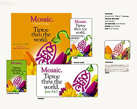
Campaign Title: TipToe Through the World
Client: Regina Mulitcultural Council
Marketing Challenge
Background: For over thirty years Mosaic has been the venue Regina residents use to celebrate their diversity and cultural heritage. In the past several years the attendance numbers have waned from 160 to 130k along with the withdrawal of several long standing pavilions. Organizers felt the event had fallen victim to a youthful “party-like” atmosphere and had resulted in families deciding to opt out.
Challenge; To shore up attendance and help secure other pavilions waiting for their cue to exit. Focus on family and diversity. Create inclusive celebratory message in a post 911 atmosphere of fear and potential intolerance. Regain the confidence of all audiences that the event could again be viable. Far reaching campaign required for Regina and area utilizing sponsor suppliers to maximize a very small non-profit budget.
Message
“Join us for three days of diverse cultural celebration with family fun, entertainment, food and dance.”
Addressing the audience: The creative speaks to kids and families while communicating in a fun , festive, friendly tone and manner. Reassuring tone that all is well with the world and it’s a great time to celebrate differences.
Campaign Objectives
Increase attendance and support for the festival.
Target Audience
Primary: All Regina and area residents with a focus on family.
Secondary: Pavilions and organizers.
Key Characteristics: The audience has attended in the past but felt the direction of the festival was moving away from the family toward a younger “party” crowd. Post 911 audience is potentially fearful of charged political atmosphere and negative international press.
Creative Strategy and Implementation
“Tip Toe Through the World.”
Using a turn of a phrase on the well known “Tip Toe through the Tulips” song to help deliver some immediate equity for their very limited budget,
The campaign featured growing colourful flowers to represent cultural diversity coming together harmoniously. Using the headline in all media to help deepen the pool of an otherwise insufficient budget and donated less than ideal space and time.
Media Strategy
Limited budget meant utilizing free outdoor boards, donated TV time, print and radio.
• Television -1 30” spot with 2 sponsor tags
• Radio 2 x 30”
• Newspaper - Banner and 1/2 page
• Point of Purchase – tent cards
• Out-of-Home - Mailer
• Public Relations
• On-Line static web page
• Outdoor
Total Media Expenditure
• Under $15 Thousand
Many levels of sponsorship allowed for large and small corporate opportunities for exposure and in-kind media
Evidence of Results
Record numbers attended the festival for the first and second years of the 2 year campaign. Targets from previous years were dwarfed by the “most ever” attendance figures of over 220,000 visitors. (Regina has only 190,000 population). Organizers had to quickly print more passports and deliver them to pavilions during the event to take advantage of the incredible demand. The festival’s success has managed to redeliver patrons and even pavilions that had for several years been absent. The Mosaic organizers have enjoyed the glowing results of their re-invigorated festival.